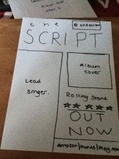
This is my first draft for the magazine advert.
The band logo is at the top of the page following the convetions of a magazine advert.
The background would be black which is why i would put the picture of the lead singer to the left of the advert. The picture of the lead singer would have a black background too, so when i layer the picture over the background they will merge and look as one.
The album cover will be on the right hand side of the advert. This will make it look as if the lead singer is looking at the album. Admiring their bands work. This idea is very abstract and i am unsure if i will even use it.
In the top right hand corner, i have placed the real bands twitter name. This makes it a lot more proffessional.

No comments:
Post a Comment