Friday 3 May 2013

FINAL DIGIPAK!


This is my disk design. Obviously the CD would be round, but I was unable to crop around it to place it into my blog.
Evaluation : Question 4
How did you use new technologies in the construction, research, planning and evaluation stages?
YouTube was the main website in helping my creativity and research as i was able to look at different music videos and tutorials which would be able to help me and make my music video look more proffessional and 'put together'.Google was a close contented for the top spot, but i used google for researching about digipaks, magazine adverts and music videos. It also helped me to evaluate magazine adverts and digipaks as i would be able to get the images off of the inernet and copy and paste the images straight into where i was typing and analysing them.
To shoot the shots for the music video, we used some of the schools cameras which we allowed to rent out and use to complete the music video, advert or the digipak. On the subject of cameras, when we didnt have the school cameras, if we need to do a little test shooting, we got out our phones, ipods or our own ammateur cameras and did a few shots, this allowed us to keep and library of shots thatg we either knew we wanted to use or shots that we liked.
Evaluation : Question 3
What have you learned from your audience feedback?
Audience feedback was very helpful as the audience pointed out where and how we could improve our media products making the more affective and improve them to the standards our audience would like to see as a finished product. They also gave us some positive feedback about what parts they enjoyed and thought should be kept the way they are. Feedback gives you an idea about what how you can change something on your piece.In the music video, we had a few different casts to begin with. This changed because as filming continued, some of the cast could not be at every filming or could not do the music video at all any more. This made us change the cast, but by chnging the cast and picking new actors for both the narrative sections and new actors for the band shots,it improved our video. I say it improved our video because to begin with, to pick our cast we looked around the class room and picked 3 random people for the band shots. The same for the narrative sections. We took a few test shots and let some of our peers have a look and comment on what we have filmed. Our peers said that they did not think there was enought connection or chemisty between the actors. This encouraged us to pick new actors, and those actors are the guys in the band shots, Harry Stone, David Schooling anf Phillip Williams, and in the narrative shots we picked Charlie Mckenzie and Amy Moughton. These two aspiring actors were perfect for our music video as they were friends in school, it helped massively to create a sense of a realationship. Their chemistry was bnrilliant and it looked real.
With my digipak, I evaluated a couple of existing preffessional digipaks, this allowed me to get an understanding of what I was really meant to be putting onto the document. The Lyrics were the thoughest part. I say that because i got conflicting messages coming from audience feedback because they were saying "the text was too small, I could not read it", and some others were saying the "text is too big, if it was smaller you would be able to fit more in." . This put me in two minds. Should I, or shouldn't. In the end i chose to not make thee font smaller as on the sceen, the font was a good size. The font size was 7 or something very close to that, but once i had seen the final piece that came from the printer I was worried that the text was too big, and that i should have made it a little smaller so it would make it look more proffessional.
With my magazine advert, they element that was the most difficult for people to accept was the overlayed text. One person said to me, "It looks like you have another piece of work over thee top of it." . This obviously made me think about the overlay carfeully and wether i should take it out. Which would mean i would gain audience likability, but my advert would not be linking in with my groups promotional package.
Evaluation : Question 2
How effective is the combination of your main and ancillary texts?
As a group, we created a style guide in which contains the font we will be using, certain effects we will be using, what will be similar between out individual products and this helped us to make all of our ancillary tasks relate to each other. For my ancillary tasks, i used the same font for the logo.
Combining and relating my music video to my ancillarys task was tricky, but not impossible. The image on the front of my digipak and magazine advert are both using the same people as the band in the music video, they are wearing the same clothes and their hair looks that same. I also used similar images on my magazine advert and digipak as the band shots in the music video. This helps the audience to connect with the music video and my ancillary tasks.
Evaluation : Question 1
In what ways does your media product use, develop or challenge forms and conventions of real media products?
From researching different music videos from the pop/rock genre we picked up codes and conventions that we could implement onto our music video for The Script. The type of videos we were after were videos that have a parallel narrative running through the whole video. This means that there will be both band shots and narrative shots that show a story. We implemented this by having band shots that run mainly through the chorus's and narrative shots that show mainly through the verses, although this is a little different for the last chorus, where the climax in the narrative story peaks, so you see more of it.
From last year, and looking at magazines, both school and a music magazine, I was able to gain a knowledge of different types of layout and furniture. Although there there is a difference between a magazine cover to a magazine advert I was able to translate some of the codes and conventions. For instance I used a banner that is at the bottom of the advert, which includes places where you would realistically be able to buy the album. On my advert I put Amazon, iTunes and Play.com. This banner gives the advert a more professional look.
I think that the one thing that challenged and almost created a new code and convention was my idea of overlaying text across the products. The over laying text was actually lyrics from songs by the Script, so it wasnt completely random. But by doing this it added dimension to our work as a team as well as individually. It makes the audience or people viewing our work look closer because at first they might be like what is that coving the image, but as they look closer, they will see text overlayed all of our products. This is a code a convention that we used throughout our teams promotional package meaning that which ever one you see on its own, you would be able to connect it back to the others and our promotional package.
Saturday 9 February 2013
CD Digipak draft 1
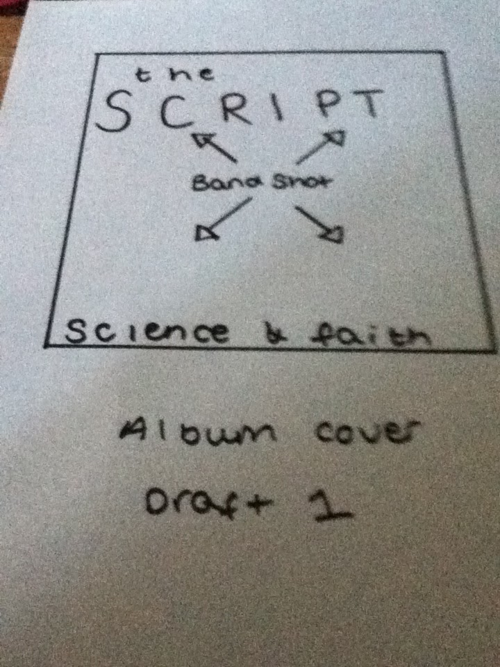
Like all the others the band shot will spread across the whole cover. Making it stand out.
The band logo is big and streched across the top of the cover. This allows the lgog to be seen from a distance.
The science and faith will be at the bottom of the cover. This will make it stand out as i will make it so the logo and the title will frame the faces in the picture.
CD Digipak draft 2

Just like my first draft, there will be a band shot spreading over the cover of the digipak.
The Script logo is at the top left hand corner, and the science and faith title is verticle on the right hand side.
This is a very simplistic logo as i allows the picture to speak for itself.
CD Digipak draft 3

This is my third draft for my digipak cover.
Across the whole cover, there will be a band shot. This shows off the band member to the audience and the consumer.
The words written in pencil, "the Script" is also the band logo. The reason why i wrote it in pencil is because i wanted to show the different opacity. Having the logo a different opacity from the background image allows more space for the image but still having the logo.
The science and faith will be at the bottom in a small font but streched across. This will balance the page by making it look fuller.
Friday 8 February 2013
Magazine advert draft 3

Again, the logo for the band is at the top of the page, it could be considered the mast head of the advert if you like.
The key band image spread across the advert. This allows a better, wider image making the finished advert look even better.
The album cover is in the lower left hand corner. In hindsight this isnt the best place for the album cover, but as a completed piece of work is balances the advert.
The "cover lines" next to the album cover include a rating of the album from a magazine. I chose Rolling Stone magazine as it is a well established music magazine sold nationwide.
The "OUT NOW" part of the cover lines would be a lot bigger, as to fill the space and to attract the audience.
In addition, I could also add a bar at the bottom to advertise where you can buy the album, for instance I could have iTunes, Amazon and Play.
Magazine advert draft 2

The logo for the band is at the top of the page.
The album cover is in the middle of the page. This is the main focus of the eyes of the audience. This is the first place thatg they will be drawn to.
The album name, Science and Faith, is under the album cover. This allows the audience to know what they are looking at and what they potentially might be buying.
The out now right at the bottom of the page would be bigger than what it is on the drafts only because with it being bigger it will obvious to the audience.
Magazine advert draft 1

The band logo is at the top of the page following the convetions of a magazine advert.
The background would be black which is why i would put the picture of the lead singer to the left of the advert. The picture of the lead singer would have a black background too, so when i layer the picture over the background they will merge and look as one.
The album cover will be on the right hand side of the advert. This will make it look as if the lead singer is looking at the album. Admiring their bands work. This idea is very abstract and i am unsure if i will even use it.
In the top right hand corner, i have placed the real bands twitter name. This makes it a lot more proffessional.
Thursday 7 February 2013
Magazine advert analysis 2

This magazine advert is to promote Florence and the machines new album, Lungs. They are from the same genre as the Script but have more of a vintage, old school feel to their music.
- As they have used a serif font, it gives off a vintage feel to the advert.
- The bold white font which is used at the top of the advert makes a bold contrast from the black background. The same with the serif font used as the title of the album.
- The same artwork and font for the band name aswell as the album name for the advert as well as the album cover.
- The vintage looking font also ties in with the option to buy a vinyl copy of the album. Vinyl albums were used before cd's and digital music.

Magazine advert analysis 1

This magazine advert is for the killers. They are from the same genre as The Script.
- The logo on the advert is the same as their band logo. This shows continuity so that the audience are able to relate back to the album.
- The black font they used for "Day & Age" makes it stand out against the purple and white background.
- The white font to the bottom of advert is a sans serif font which stands out against the black background making it easy to read for the audience as the font size is quite small.This is the album that the advert is promoting.
- They have used the same artwork for both, again making it easy for the audience to connect with the advert.

- Their website is at the bottom, centered which allows the audience viewing the advert to find our more information about their new album, Day & Age.

Saturday 2 February 2013
Final logo design.
After analysing a few existing logo's, and ananlysing our other creatations, we came to a design that we all liked and would use on our products that we create.
 After creating several logos by our selves, we came to the decision that we liked the handwritten element and the script like element. So we converged them into one logo.
This is our logo that will be used thorughout the promotional package.
It uses many conventions of existing logos, such as the bold black font. This makes it visible from a distance. The font is large making easy to read and identifiable. The font we used for "The Script" was Prestige Elite Standard. This gives the impression of a typewritten script, adding depth to the concept.
"For the first time" is a font called Mistral. It is a handwritten looking font which gives the illusion it is handwritten. This adds a personal touch and feel to the logo which may make a connection with the audience.
We did set "rules" for the logo. What i mean by that is that if it is a light background the font colour would be black. and the opposite if the background was a dark colour, the text colour would be white. This allows the audience to see the logo from a distance whatever the background colour is.
Potential logo designs
The picture below is a collection of our potential logo designs.
From the existing logo analysis, we produced several concept logo designs on the computer. As a group we then decided what logo suited us better. At first we chose the bottom one. But after placing it on drafts we decided against it.
We were all drawn to the middle top logo. We liked the and we liked how it looked on drafts. It adds the personal touch as it looks handwritten.
We were also drawn to the logo on the right at the bottom. The font looks like a typewritten script, which would link in with the band name, The Script. Also, after placing in our drafts it looks the best aesthetically.

Friday 1 February 2013
Existing logo analysis

The black font is striking and bold. It is unlike any other band logo which means they will not be mistaken for anyone else. The contrast between black and white also add another dimension to the logo.

The Killers logo is also black and white, and again this is used to make a contrast and making it easier to be read from far away. The word "Killers" is using a font that is made up of little white round circles. This makes me think of the traditional banners surrounding intimate music venues and broadway shows. . Without listening to any of their music is makes me think they could be a little old fashioned.

This is the logo for The Script. The background looks like an old, tea stained piece of paper which portray an old maybe traditional style band. The font is bold and black to stand out, it makes it easier to see from a distance attracting the audience. The angular style of the font adds depth to the logo. It makes it more interesting.
Tuesday 29 January 2013
Style guide
Below is our style guide. This is so across all of the group products, the styles will be the same. It includes fonts, sizes, colour, layouts and more. We use a sstyle guide because we want each of our products to relate and connect so tthe audience is able to see that they are of a group effort and not individual.
The font that we will be using for our body copy is the ‘Prestige Elite STD’ and the size will be proportionate to the product that is being created. The font that we will be using for the subheadings is ‘Prestige Elite Std’ again but use bold or italic. A size that is suitable to the product. The reason that we have chosen to use this font is because it is similar to the font style used on the logo, this means that the sense of a typewriter is followed throughout the project and becomes a convention of our band.
The colour scheme for the house style that we will be using across the project is black and white, this is because the colours contrast with each other and stand out more to the audience. The music is quite mellow and not a very upbeat song, the lyrics are about a couple just trying to make the relationship work. The colours represent the narrative. Black and white are contrasting colours, they show two sides to the story.
Props – The props include a pregnancy test, the reason that the pregnancy test is being used is to show the loss of innocence; teddy bear, the reason that we are using the bear is to show the childhood, the innocence.
Costumes – It is going to be black and white. This will be white shirts, black shirts, black leather jacket etc. The idea is to have the two members of the couple, one in black and one in white. As the story moves towards the conclusion, we are having the members slowly change to wearing grey, a middle colour that represents that life is not black and white. The band members will be wearing black and white throughout the whole video, showing they are out of the narrative but part of the story. While I was evaluating the pop videos I found that the band members wore black and white, this helps to position the video in the genre by following the conventions.
Locations – House, the house needs to look like a family house, owned by parents. This makes it more realistic, as it follows real life and shows how young the people are. Car, the reason that we are using a car to show the boy drinking being depressed, instead of a bar is because it is more isolated. It emphasises the feeling of depression and sadness. Bedroom, we are going to be using a bedroom, as it is another way of showing isolation, it also makes adds to the sense of innocence and childhood. We are going to be using an isolated area for band shots, this is to help the audience to separate the band from the story.
Photography – The photography is going to include low key lighting, with the three band members next to each other, behind each other etc. We are using low key lighting for the photography as it makes the photo more dramatic, creating intriguing and appealing shadows. The shadows also make the features on the models face stand out, making the photo more attractive. From the research undertaken on the genre, it is also a convention used by many bands.
Existing product analysis 3
The Man Who Can't Be Moved - The Script.
In the beginning of the video, the camera shots are very interesting. It changes from forward facing shots, to shots looking towards the ground and shots looking at the back of him. They are very abstract and attract you to watch the remainder of the video. When the lead singer, Danny, starts singing, the camera shows his face. This is to act aas if he is saying the lyrics to us, the audience. Which breaks the forth wall, which is an element of the theatre practitioner, Bertolt Brecht. It engages the audience making them feel a part of the video therefore allowing them to empathise with the narrative of the video.
As the video plays, it carrys on showing him walking though the city, retracing his steps maybe, to find the person he is looking for. They show this by using a tracking shot of him croossing the street.
The engagment with the audience continues with the like "if you see this girl can you tell her where i am". in coonjunction with saying this, he looks towards the camera aas if he is saying it to the audience. Therefore keeeping us engaged.
The continued motif of close up shots of his face allows you to connct and empathise with him. It also enables the producer of the video to make us concentrate on Danny, rather than the member of public walking down the street.
The band shots are set in what looks like an underground car park. This isolated setting is to show both the difference with the character, that the lead singer is playing and the lead singer in the band shots and to separate the narrative and the band shots. In my personal opinion, some of the band shots are a little static and would be better with movment.
One of my favourite shots is one where Danny is singing in the street during one of the narrative sections, the camera pans up and rotates while panning. It adds movement and adds that something special to the video.
Existing product analysis 2
The Script - Before The Worst
The first shot is a panning shot of Danny, the lead singer, walking backstage of an arena. Then the second shot is also a panning shot of the audience seats in the arena. Both of these shots allows the audience to gain understanding of where the video is set and it also sets the motion in the video.
The hand held following shots really make the audience feel as if they are following Danny to the stage going throught the last rehearsals. This make the audience member feel a connection towards him.
A panning shot during the first chorus really sets the scene. It shows the audience watching the video where they are setting the video.
Existing product analysis 1
The Script - Nothing
The first shot is pretty abstract. It is of a woman floating in water. Although this is an abstract shot, the audience will be attracted by this as they will want to find out what it is. The shot is from directly beneath her, this adds depth to the video, no pun intended.
One of the next shots is also an abstract shot where what it looks like is a sheet of red fabric being blown accross the cameras field of view to make interesting patterns. The editors of the video also put the shot in a low focus, this draws the attention of the audience and attracts them to watch the rest of the video.
One of the shots is of the lead singer Danny, he is getting the attention of the bartender. The sound of that specific shot has been muted and you are left with Danny asking th bartender for another drink, and the track. This is good as you feel that the video could be what happened last night for Danny in real life. That interests the audience as it makes them feel as if they might be able to see him on a night out.
The handheld shots attract the audience even more as it puts you in the frame of the camera as well as one of the friends in the narrative sections of the video.
The abstract shots seem to be a motif of the video as they continue through the video. The camera is very close to the object adding mystery and wonder.
Monday 28 January 2013
Chosen Band & Song
After a lot of debate, as a group we come to the decision of The Script to be our chosen band.
We decided on The Script because their songs are very heartfelt and emotional which we thought was good for a music video. Also, they are very popular at the moment as their songs are high in the charts and their albums have one many awards as the band itself has. Individually, we listened to The Script songs from their albums, 'The Script', 'Science & Faith' and '3', from their begginings to thier latest tracks and it was very hard to pick a song.

We decided on The Script because their songs are very heartfelt and emotional which we thought was good for a music video. Also, they are very popular at the moment as their songs are high in the charts and their albums have one many awards as the band itself has. Individually, we listened to The Script songs from their albums, 'The Script', 'Science & Faith' and '3', from their begginings to thier latest tracks and it was very hard to pick a song.
Eventually, after listening to all of their published tracks, we decided to use 'For the First Time'. The reason why we picked this song is because it is in the the top 5 most listened to songs by The Script. It has a lot of meaning behind the lyrics aswell.
Chosen Genre
One of the main resons we have chosen the Pop Rock music genre is because it is one of the most popular genres in the world.
The Pop Rock, or Alternative Rock, genre includes some of the most famous and most popular bands such as Coldplay, The Script, The Killers, Nickelback and Greenday just to name a few. This was another incentive to pick Pop Rock. The choice of music style and type is like no other.
Looking forward, the next step is to analyse the bands and make a final decision on the band that we are going to pick. As individuals, Shannon, Harry and I enjoy listening to this genre so picking a band will be tricky but we know that the genre is perfect.
Monday 14 January 2013
Mood Boards
Together as a group, we put together 3 mood boards containing bands from Pop, Pop Rock and Rock genres. This enables us to have a good undertanding of what types of bands and what sort of music comes from those said genres.


The picture above is showing bands that are associated with the genre of pop.

The picture above is showing bands that are associated with the genre of pop rock.

The picture above is showing bands that are associated with the genre of rock.
With these mood boards it helped us to decide what band to pick from the type of music.
As a group we looked at the pop mood board and decided that we wanted to portray a message and doing a pop music video would be a little too challenging to portray a message.
We kind of thought the same about the rock genre, we thought that with doing a rock music video the message would be overshadowed by the music.
So we focused out time and energies on the Pop Rock genre.
Subscribe to:
Posts (Atom)